Everyone’s using their phones
If you’ve ever been on public transport, you’ve probably seen people on their smartphones. In fact, if you’ve walked about, or driven anywhere, you’ve probably seen a person tapping away on their phones, more likely than not.
People are doing everything, from socialising, to paying bills, watching video, and reading articles on their phones. All this while they’re on their commute—and this is time you used to have reading the newspaper or looking out the window!
If your website isn’t designed to handle users using different devices, they won’t be happy. Some will put up with it (especially if you’ve got useful information no-one else has), some may tolerate it.
But other users may become agitated, frustrated, and may end up leaving your site, without the information they were after, without getting what they needed done, without buying the most expensive thing in your shop on their phone because it was just too difficult.
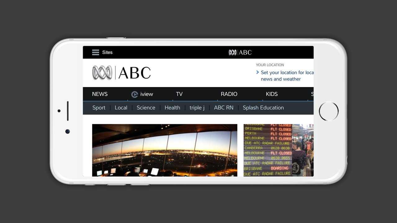
By not designing your site properly, you can’t assume your users will be able to see what they’re after:
If you aren’t prepared, your visitors won’t be able to find the Sports section! Luckily, the ABC does do something to remedy this below.
But what do you need to do to make things easier for the people that visit your site? There’s a couple of options I’ll investigate:
Option 1: Give them their own site!
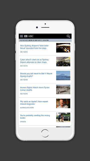
This idea is great if you’re looking to make a fresh start without depending on your existing code. All you have to do is create a new site that is solely dedicated to your mobile users, style it, and redirect them when you detect it! In fact, this is what the ABC (Australian Broadcasting Corporation) does for their website:
A separate site design can be appropriate, if you have the resources.
But that means you have to deal with the fact you have not just one, but two site codebases. Two different site structures, two different stylesheets, and two different experiences. If you ever update one of the sites, you’ll have to modify the other as well.
You might have noticed another problem, and that is the fact you’ve got the site nailed down for desktop and mobile users. But what about those tablet users? Or the super amazing smartwatch? Or that hologram system you’ve never heard about before that is shaped like a car?
If you’ve gone down this route before, you’re probably regretting it a lot now.
This brings us to a solution that likely better works for you:
Option 2: Responsive Design
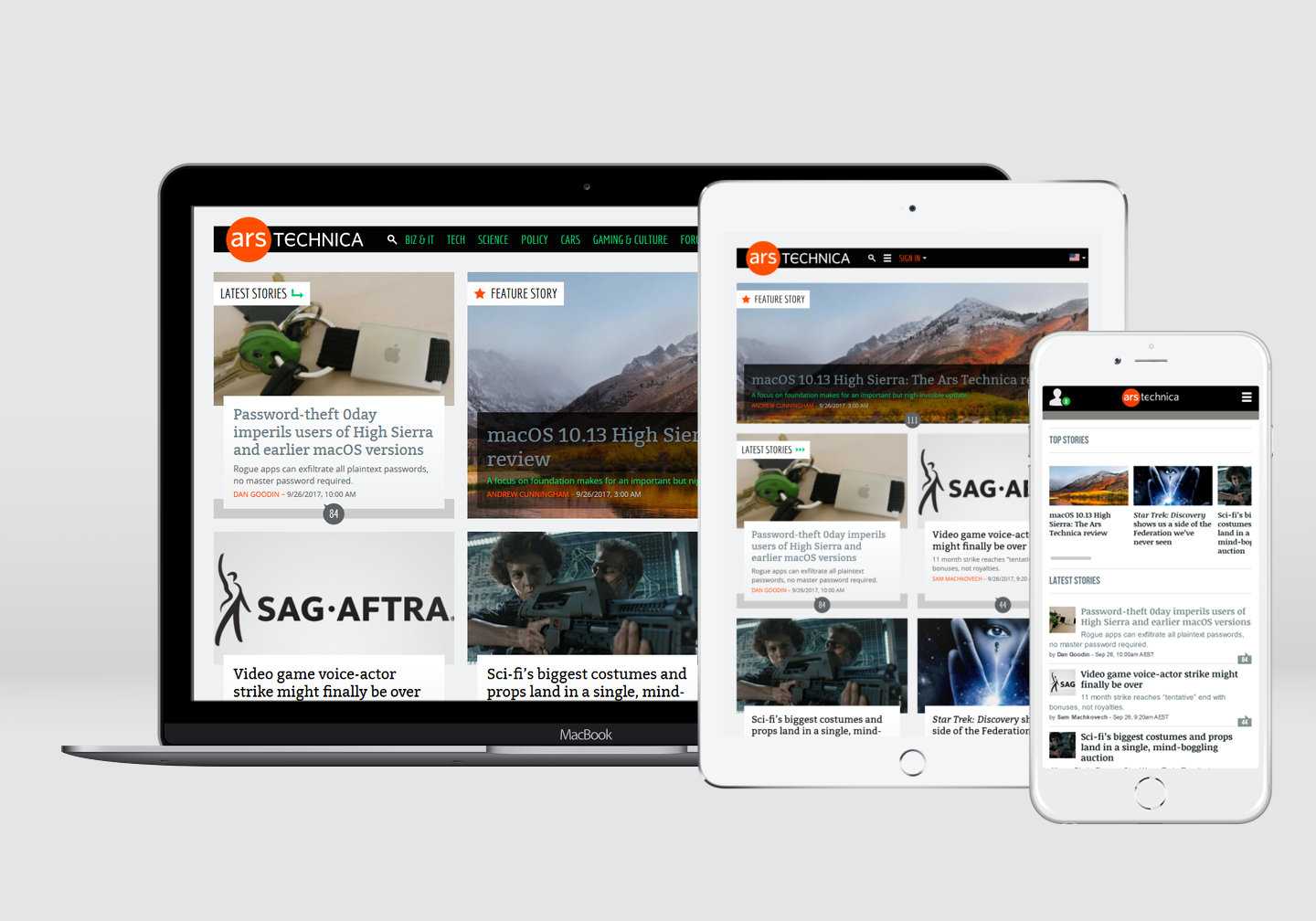
When the design of the website is optimised to respond to the various differences between devices, it’s called responsive design—meaning a user has a useful experience, no matter what platform they’re coming from.
The Ars Technica website uses responsive design to tailor the experience for users of different devices.
For your desktop users, they will have the same experience as they’ve had before, no surprises there.
But for people visiting on their tablets and smartphones, your site’s design will adapt to suit their devices. What does that entail exactly? Well, there are a few options, depending on what your designer may tell you:
- Make essential actions easy to access
- Place navigation links under a dropdown menu
- Collapse main content and controls into columns
- Serve up smaller pictures for smaller devices
The end result is that your site is easier for people to access and use, particularly those that aren’t desktop users. Tablet users, mobile users, even laptop users can benefit from this!
But watch out, and make sure that the resulting design should make a user’s life easier, rather than more difficult. Consider what it is that users want from your site, and how they can access it. Don’t just drop things for the sake of dropping things.
In conclusion
A lot of people are getting online with their smartphones, and it’s expected to grow. If you are still running a desktop-exclusive site design, your visitors won’t be as happy as being given a tailored experience.
You could make a dedicated site design, but that’s more code, and more time sunk into making and maintaining it. Alternatively, you could integrate responsive design into your site, and make everyone a little more happier at the cost of a little file-size.
Regardless of your approach, you should make sure that if you’re changing the experience for people on different devices, you shouldn’t take something away that they need. Make it easy to use, and everyone will be happier for it. Including you.
